Lead Product Designer

Hey, I'm
Sharath SP

Lead Product Designer with 10 years of experience launching, scaling, and revamping high-impact digital products. Expert at driving end-to-end design processes—from deep user research to high-fidelity execution—with a proven ability to align user-centric solutions with aggressive monetization and growth strategies. A collaborative leader experienced in GenAI integration, mentorship, and managing design verticals that have contributed to over 117.5 Cr GMV.

Sharath SP
Bengaluru, India
10+
Years
5
Products
60M+
Users
UX Design
Product Strategy
User Research
Interaction Design
Interface Design
Prototyping
Design Systems
Competitive Research
UX Design
Product Strategy
User Research
Interaction Design
Interface Design
Prototyping
Design Systems
Competitive Research

Case Studies

End-to-end product design across gaming, creator tools, AI-powered interview prep, and civic tech — driving measurable engagement, retention, and revenue at Moj and Apna, plus a live PWA shipped solo with AI as engineering partner.

Apna AI Interview Prep
01
Apna · AI Product
AI Interview Prep
Redesigning a voice-based mock interview tool for clarity, completion, and confidence.
+57%Daily Users
4.3xWAU Penetration
7K+Daily Events
Hungry Game
02
Moj App · Game Design
Hungry Game
A roulette-style engagement game where users trade Cheers for digital items.
21K MAUMonthly Active
25M Cheers/dayDaily Spend
62% D7Retention
Creator Battle
03
Moj App · Livestream
Creator Battle
A time-bounded livestream battle between creators that drives gifter monetisation.
32K/dayDaily Battles
60–65%GMV Share
5.8KDaily Gifters
Mission Moj
04
Moj App · Gamification
Mission Moj
Gamification system that enhances engagement, motivation, and daily retention.
40%App Adoption
30%Gifter DAU
15%Recharge DAU
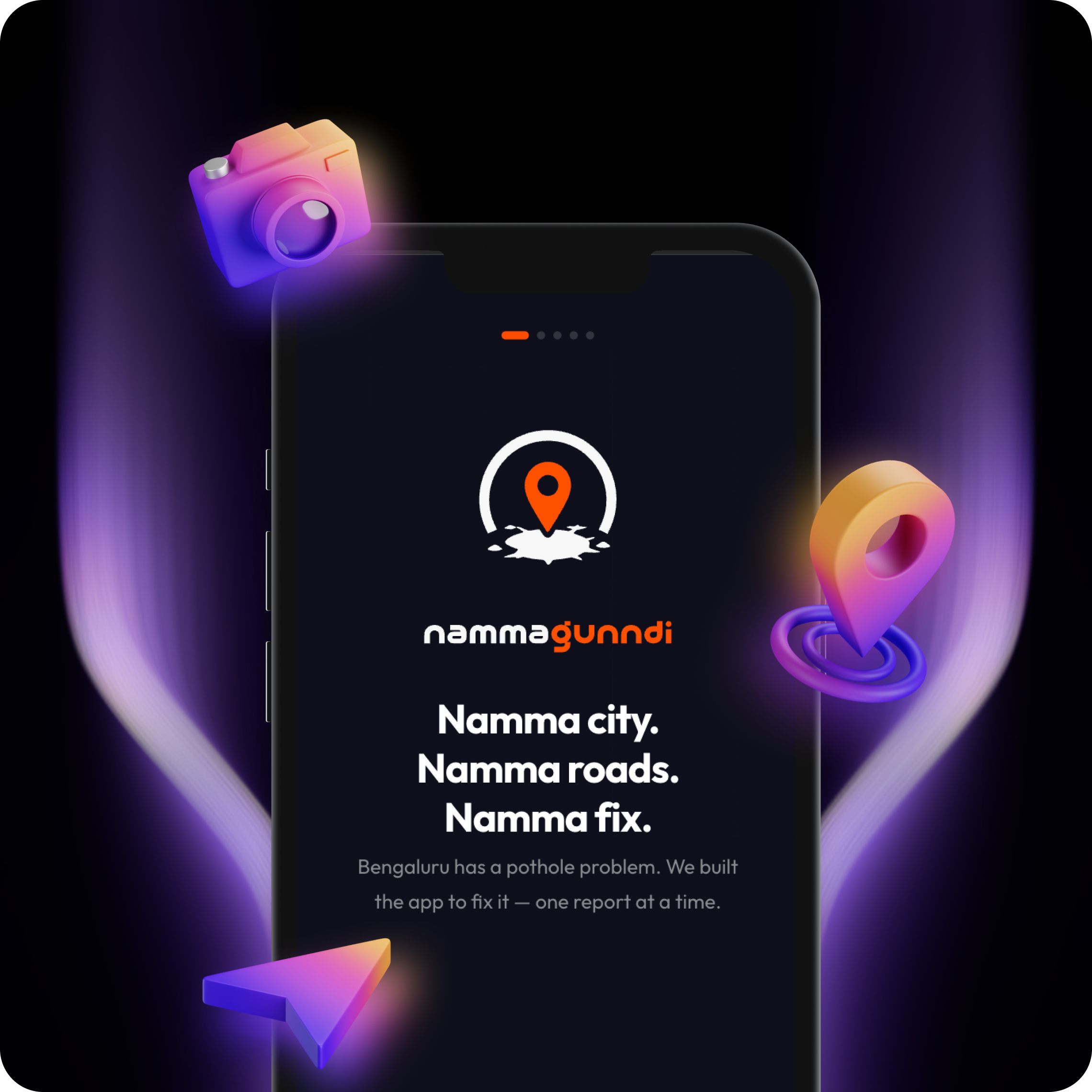
Namma Gunndi 3D mockup with camera, location pin, and arrow
05
Personal · Civic Tech
Namma Gunndi
A civic issue-reporting PWA for Bengaluru citizens — built solo with AI as engineering partner.
LIVEPWA Shipped
SoloDesigner + AI
Full-stackFirebase + Gemini

Designing with a
product lens

I am a Lead Product Designer who keeps users at the heart of every decision, delivering experiences backed by thorough research and product thinking.

Over 10+ years at Apna, ShareChat and Moj, I've launched, scaled, and revamped features across livestreaming, gaming, and social engagement — working with cross-functional teams to ship things that truly move metrics.

My approach blends competitive research, interaction design, and systems thinking to create cohesive, intuitive products at scale.

Tools & Methods

Figma
Figma Make
Claude
Loveable
Photoshop
Illustrator
After Effects
Framer
Jira
Notion

Experience

Apna
Lead Product Designer — Apna Candidate & AI Interview Prep
Nov 2024–Now
ShareChat / Moj
UX Designer 3 (Lead/IC) — Livestream & Gaming
Apr 2023–Nov 2024
ShareChat
UX Designer 2
Apr 2021–Apr 2023
ShareChat
UX Designer 1 & Interaction Designer
Aug 2019–Mar 2021
ShareChat
Senior / Junior Graphic Designer
Jul 2015–Aug 2019

Role

UX Design
Interface Design
Competitive Research
Motion Design Lead

Let's build something
remarkable

Open to lead design roles, collaborations, and conversations about great product work.

Sharathsp57@gmail.com
Hungry
Game
Client
Moj App
Role
UX Designer · Interface Design
Team
UX · Motion · Visual
Type
Game Design · Gamification
Overview

A roulette game where Cheers become wins

Hungry Game is a roulette-style wheel-spin activity on Moj where users trade Cheers for digital items. The platform offers a random opportunity to earn free Cheers as prizes — the more valuable the item, the higher the potential reward.

Hungry Game Cheers Screen
Impact

Numbers that matter

21K

Monthly Active Users play Hungry Game

25M

Cheers spent daily in Hungry Games

76L

All-time GMV recharge from multiplier experiment

62%

D7 retention — surpassing D1 retention rates

The Challenge

Three outcomes, one product

01

Delight & Retention

Create additional delight leading to higher retention and increased GMV through engaging gameplay loops.

02

Onboard New Rechargers

Use the game mechanic to convert passive users into active Cheers spenders for the first time.

03

Revenue Source

Establish Hungry Game as an additional, sustainable revenue stream for the Moj platform.

04

Competitive Differentiation

Outperform existing game formats with better visual hierarchy, item visibility, and bidding flexibility.

Competitive Research

What the market got wrong

MIKA LIVE

Weak and monotonous visual design

Poor visibility of items on display

Only 4 options of bidding amount

No option to decrease or minus the bid

POPO LIVE

No visual hierarchy for bidding items

Withdrawal of a bid is not possible

Uninspiring and generic graphics

Fewer items available for bidding

UP LIVE

Overloaded and cluttered UI

Withdrawal of a bid is not possible

Item visibility obstructed by bid amounts

Competitor screen 1
Competitor screen 2
Competitor screen 3
User Flow

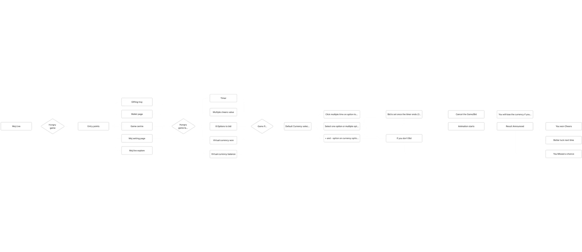
Mapping the full journey

Flow
Wireframes

Low → Mid → Final

Explored circular and grid views. Settled on grid for visual balance and enhanced item visibility — with three colour backdrop iterations to test selection clarity.

01 Low Fidelity
Hungry Game low-fidelity wireframe 1
Hungry Game low-fidelity wireframe 2
Hungry Game low-fidelity wireframe 3 — central screen
Hungry Game low-fidelity wireframe 4
Hungry Game low-fidelity wireframe 5
02 Mid Fidelity
Hungry Game mid-fidelity wireframe 1
Hungry Game mid-fidelity wireframe 2
Hungry Game mid-fidelity wireframe 3 — central screen
Hungry Game mid-fidelity wireframe 4
Hungry Game mid-fidelity wireframe 5
Final Designs

The finished experience

Design Library

Assets from the design system

Icon 01
Icon 01
Icon 02
Icon 02
Icon 03
Icon 03
Icon 04
Icon 04
Icon 05
Icon 05
Icon 06
Icon 06
Icon 07
Icon 07
Icon 08
Icon 08
Icon 09
Icon 09
Icon 10
Icon 10
Icon 11
Icon 11
Icon 12
Icon 12
Icon 13
Icon 13
Icon 14
Icon 14
Icon 15
Icon 15
Icon 16
Icon 16
Icon 17
Icon 17
Icon 18
Icon 18
Icon 01
Icon 01
Icon 02
Icon 02
Icon 03
Icon 03
Icon 04
Icon 04
Icon 05
Icon 05
Icon 06
Icon 06
Icon 07
Icon 07
Icon 08
Icon 08
Icon 09
Icon 09
Icon 10
Icon 10
Icon 11
Icon 11
Icon 12
Icon 12
Icon 13
Icon 13
Icon 14
Icon 14
Icon 15
Icon 15
Icon 16
Icon 16
Icon 17
Icon 17
Icon 18
Icon 18
Creator
Battle
Client
Moj App
Role
UX Designer · Interface Design
Team
UX · Motion · Visual
Type
Livestream · Monetisation
Overview

Live battles that turn viewers into gifters

Creator Battle is a livestream feature on Moj that enables hosts to initiate time-bounded battles against another host. It is one of the most popular features across livestream apps globally and a core driver of creator monetisation on the platform.

Impact

The scale of the feature

32K

Creator Battles happen daily on the platform

10M

Cheers spent in creator battles per day

60–65%

Of daily GMV on Moj Live comes from Creator Battle

5,800

Gifters actively engage and gift in battles daily

The Challenge

Design for three audiences at once

Build a product which will increase time-spent, increase GMV via virtual gifts, while keeping users engaged — without cluttering the core livestream experience that makes Moj compelling.

Competitive Research

Three competitors, three failure modes

YY LIVE

Weak and monotonous visual language

Poor visibility for top gifters

Overwhelming, cluttered designs on screen

TRENDO LIVE

Limited screen space for host

Earning points are not clearly defined

Uninspiring graphic quality

MIKA LIVE

Battle status bar lacks visual hierarchy

Points acquisition is unclear to users

Screen designs are too cluttered overall

Competitor screen 1
Competitor screen 2
Competitor screen 3
User Flow

Simplifying the critical path

Flow
Wireframes

Fitting two hosts on one screen

Explored split-screen layouts and battle progression UI. Settled on a vertically divided live view with a central progress bar — balancing both hosts' streams with clear visual hierarchy for gifters.

01 Low Fidelity
Creator Battle wireframe 1
Creator Battle wireframe 2 — central screen
Creator Battle wireframe 3
Flow Design

Creating a battle

Designed two different flows for the hosts to invite their opponent to the battle

Random Invite

Where creators can invite random opponent to challenge with single click and they also get to build and expand their relation with other livestream users.

Manual Invite

Where creators get to choose their battle with known opponents.

01 / 05
Battle Request
Battle Request
Request when opponent invites a Creator Battle.
Final Designs

The complete battle experience

User Feedback

What creators said

Results

The most valuable feature on Moj Live

Creator Battle became the single largest revenue driver on Moj Live — responsible for the majority of daily GMV with a highly engaged gifter base.

32K
Daily Battles
10M
Cheers / Day
65%
GMV Contribution
5.8K
Daily Gifters
Mission
Moj
Client
Moj App
Role
UX Designer · Interface Design
Team
UX · Motion · Visual
Type
Gamification · Retention
Overview

Turning everyday actions into meaningful progress

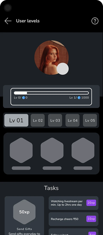
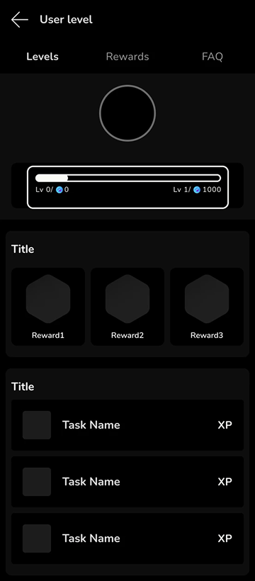
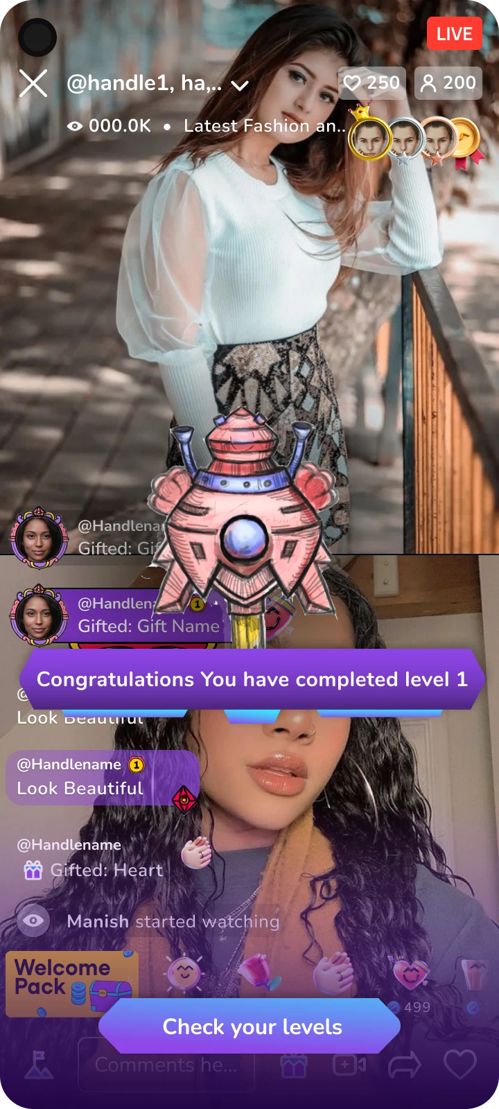
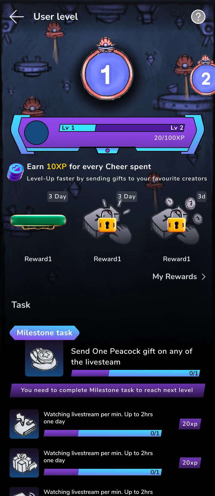
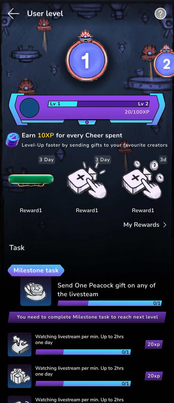
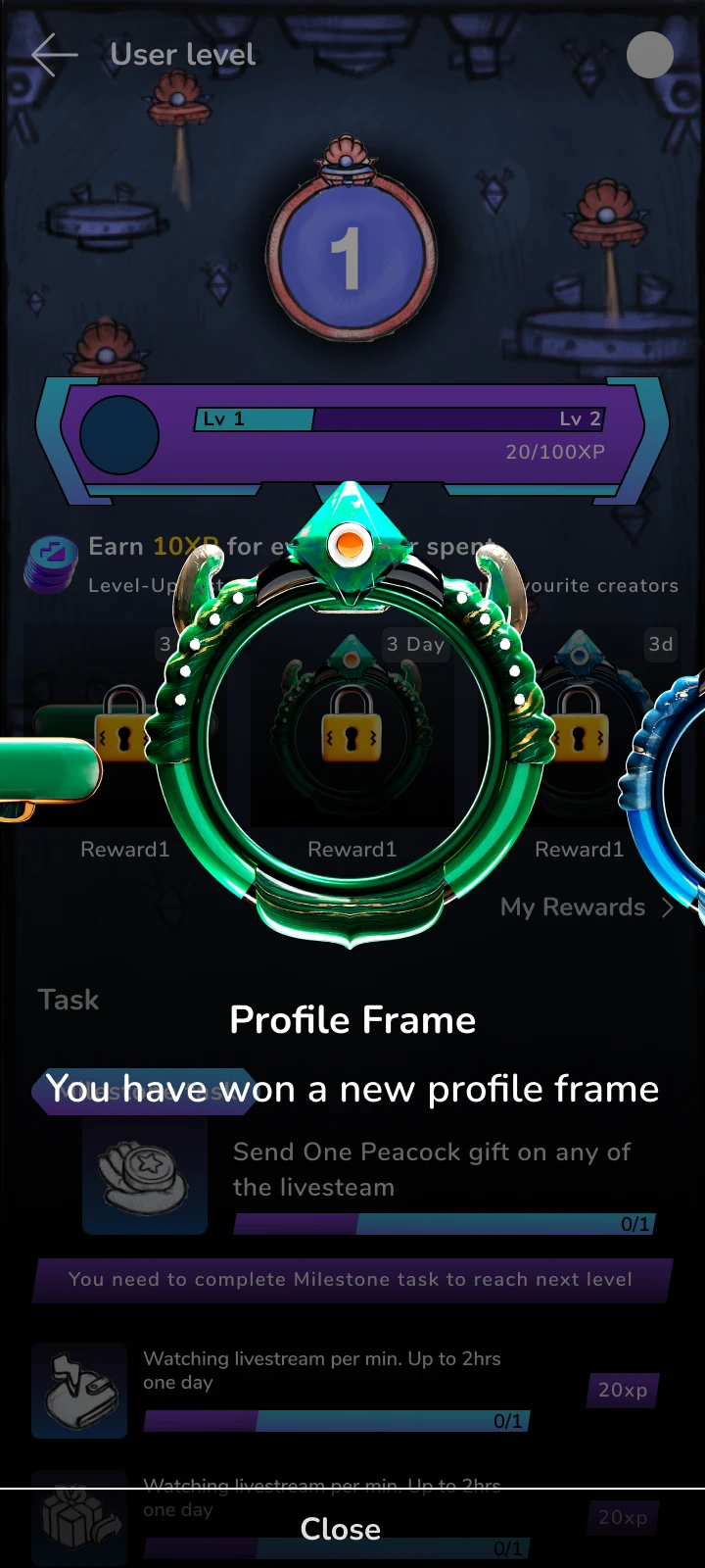
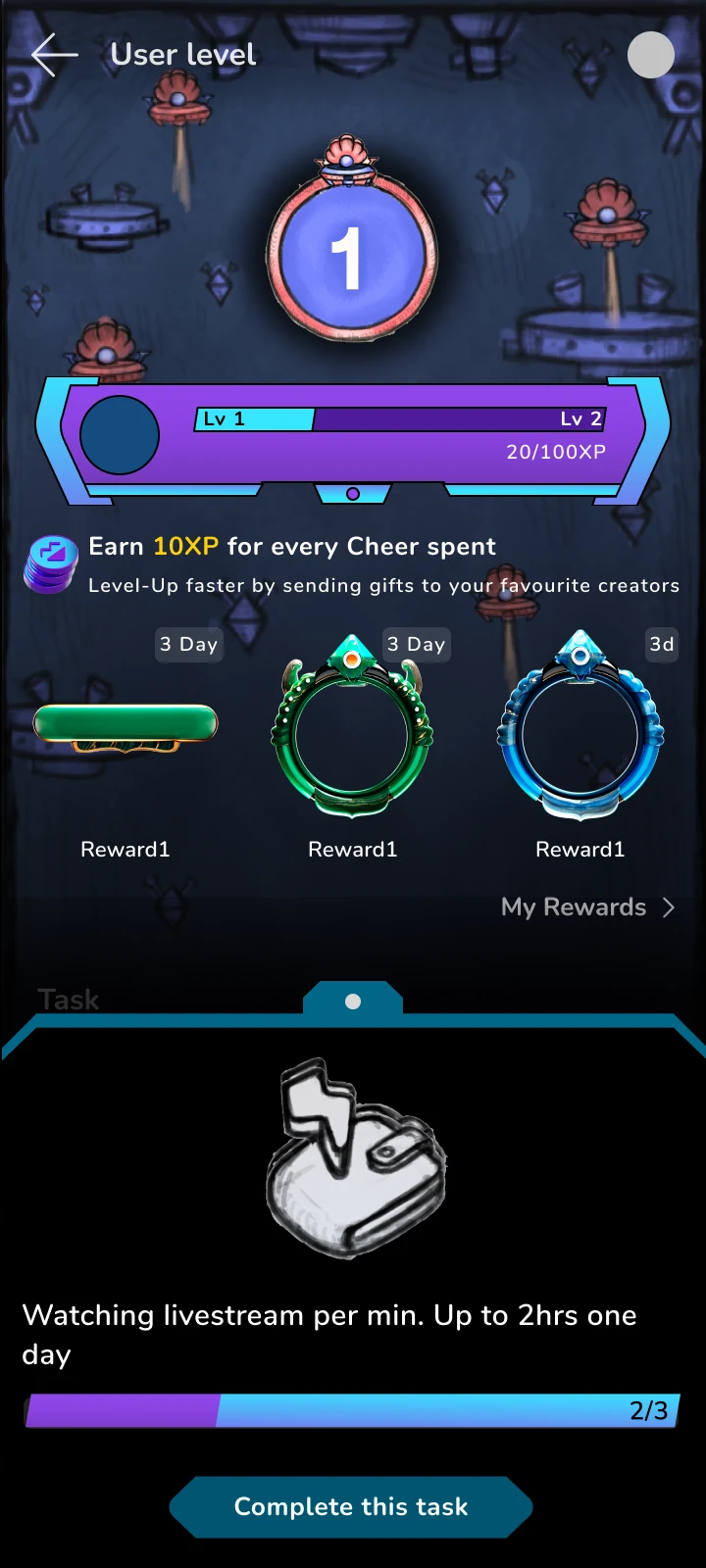
Mission Moj is a gamification system on the Moj app — designed to enhance user engagement, motivation to achieve, and personal progress. By framing regular platform behaviours as missions with visible rewards, the feature transforms passive users into active participants.
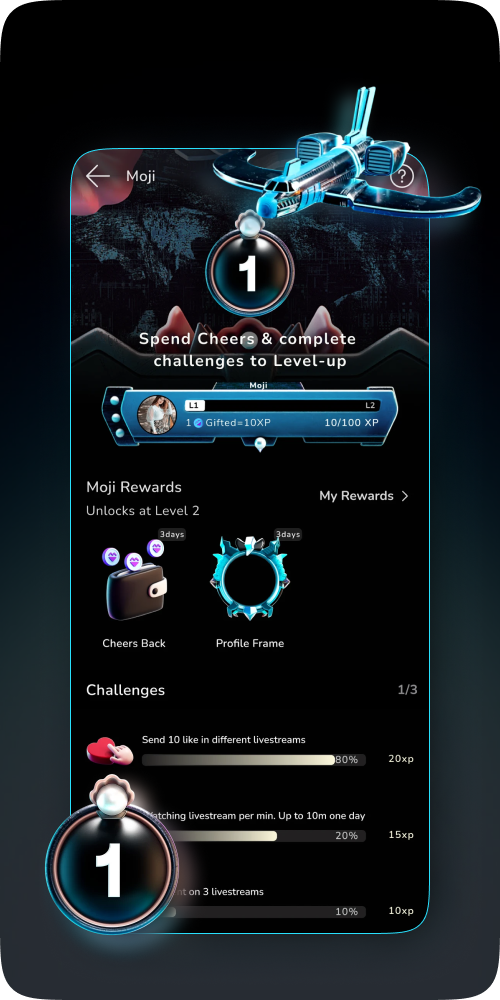
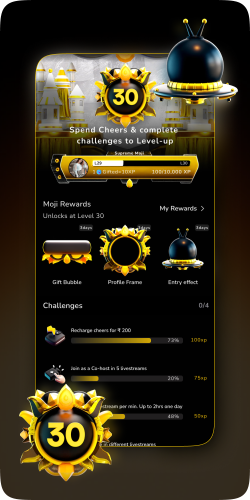
Mission Moj – Level 1
Mission Moj – Level 30
01
02
Scroll or drag
Impact

Numbers that matter

40%

Increased Moj app adoption

30%

Increase in livestream gifter DAU

15%

Increase in user recharge DAU

Design Goals

Three pillars of the system

01

Engagement

Increase the depth and frequency of user interactions by making every action feel purposeful and rewarded within a progression system.

02

Motivation

Give users clear, achievable goals that create a continuous loop of challenge, effort, and reward — keeping them coming back daily.

03

Progress

Make user advancement visible and legible through progress bars, milestones, and achievement systems that surface how far they've come.

Competitive Research

What the market got wrong

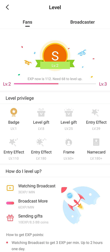
MIKA LIVE

Weak and monotonous visual design

No rewards for completing the tasks

Repetitive tasks till level 10

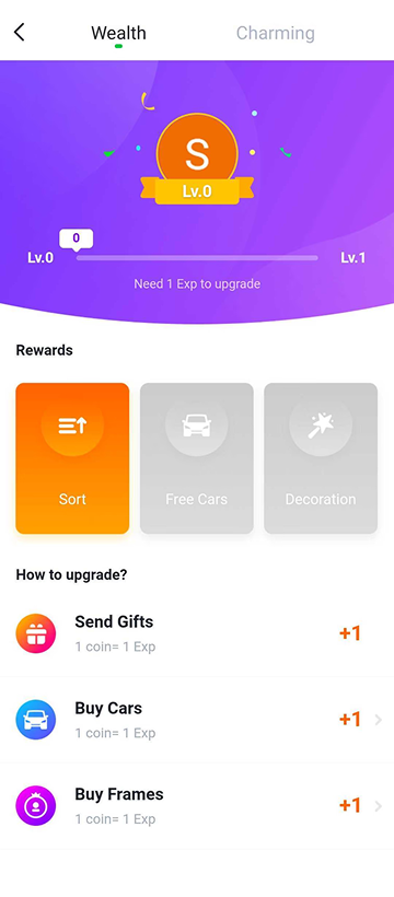
POPO LIVE

Rewards are not defined clearly

No clear onboarding for D0 users about the levels

Weak and monotonous visual design

Listed tasks may be challenging for D0 users

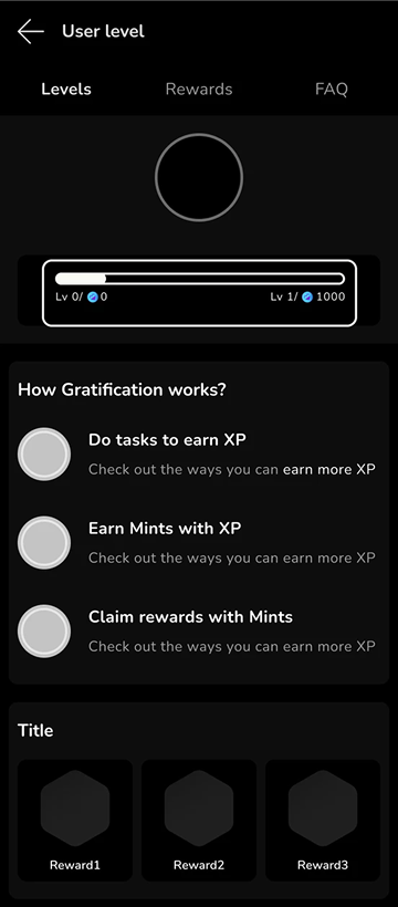
UP LIVE

Overloaded information in the UI

No rewards given after the completion of each level

Repetitive tasks in every level
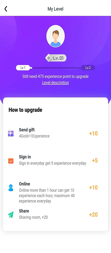
Mika Live level screen
Popo Live wealth level screen
Up Live level screen
Design Philosophy
"Gamification works best when it amplifies intrinsic motivation — not replaces it."

The core design challenge was avoiding superficial gamification — badges and streaks that feel hollow. The goal was to identify behaviours users already wanted to do and make completing them feel meaningful.

This meant anchoring missions to real platform actions: watching content, interacting with creators, gifting — and designing the reward layer to feel earned, not arbitrary.

Core Mechanics

The building blocks of the system

Daily Missions

Short, achievable tasks that reset daily — creating a recurring reason to open the app and engage with the core platform experience.

Progress Tracking

Visual progress bars and completion indicators that make advancement tangible — users can see exactly how close they are to the next reward.

Achievement Milestones

Longer-arc goals that reward sustained engagement over days and weeks, building habits and identity around being an active Moj user.

Reward Unlocks

Completing missions unlocks Cheers, exclusive profile items, and seasonal rewards — creating real platform value for consistent engagement.

Wireframes

Low → Mid Fidelity

Explored different mission card layouts and reward progression flows. Evolved from rough sketches to structured mid-fidelity screens before landing on the final system.
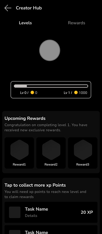
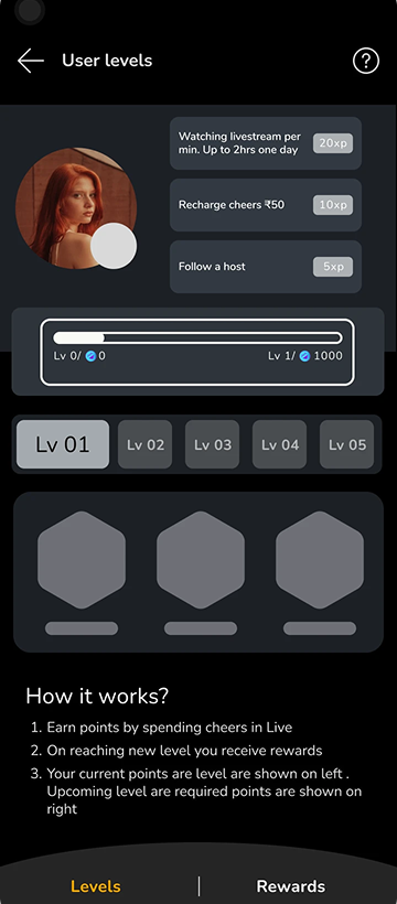
01 Low Fidelity
02 Mid Fidelity
Final Designs

The finished mission system

AI Interview
Prep
Client
Apna
Role
Lead Product Designer
Platform
Mobile · Voice-based AI
Type
User Research · Retention · Onboarding
Overview

A product that existed,
but wasn't landing

Apna's AI Interview Prep is a voice-based mock interview tool that simulates real interview rounds using AI. The product existed but wasn't landing — users were confused about what it was, how it worked, and whether they were in the right place. My work began with understanding why, not just fixing what looked broken.

After
Before
After redesign
Before redesign
Core Problems

Four cracks in the
foundation

01

Product Confusion

Users didn't understand what AI Interview Prep was or why they should use it.

02

Low Round Completion

Users started but rarely completed multiple interview rounds.

03

AI vs Real Confusion

Users couldn't distinguish a mock AI session from a real interview round.

04

Delayed Feedback

Scores and reports weren't delivered in real time after rounds completed.

Research

Watching where
mental models broke

Conducted user research and one-on-one interviews with multiple candidates. The goal was to watch them interact and understand where comprehension broke down — not just see what failed, but understand why.

"

I thought I was applying for the job. I didn't realize it was a practice interview.

— Research participant

Research confirmed all four problems and pointed to the JD page touchpoint as the primary source of confusion. Users arriving from a job description were in application mode — any subsequent step felt like part of the hiring process, not preparation for it.

Experiments

What we tried and
what actually worked

Experiment 01 ✕ Backfired

CTA on JD Page

Added a second CTA on the Job Description page alongside "Apply" — a button labelled "Prepare for Interview". Hypothesis: users about to apply would be primed to prepare first.

Outcome

Apply clicks dropped. Users misread "Prepare for Interview" as an actual step in the hiring process — deepening the AI vs real confusion rather than resolving it.

Experiment 02 ✓ Worked

Post-Apply Nudge

Moved the touchpoint to after the user had already applied for a job. A nudge appeared encouraging them to take a mock interview round — context-first, not CTA-first.

Outcome

Interview starts increased significantly. Context made intent clear — you've already applied, so any next step is obviously preparation, not the real thing.

Before After
After
Before
UX Changes

Four fixes, one
coherent experience

01

Success Animation on Completion

Celebratory animation when users finish a round — giving clear closure and reinforcing the sense of accomplishment.

02

Post-Round Dual CTAs

After completing a round: "Start next round" or "Return to job detail page" — giving users a structured path forward, not a dead end.

03

Early-Exit Recovery Flow

If a user exits within 10 seconds, treat it as "not started". Show a retake option instead of logging it as a completed session.

04

Real-Time Score Delivery

Reports and scores sent immediately after round completion — eliminating the post-session delay that broke the feedback loop.

Impact

Numbers that
tell the story

+57%
Daily Unique Users

Previous peak 3,500 → Current 5,500

4.3x
WAU Penetration Increase

From 0.7% → 3.0%

2.8 mins
Avg. Time Spent

Stabilized high engagement

7,000+
Total Daily Events

High engagement sustained

Target: Grow WAU penetration from 3% to 9–10% in the coming quarter.

Complete Flow

The full experience,
end to end

A walkthrough of the AI Interview Prep product — from job discovery through mock interview to score delivery.

Learnings

What this project
taught us

01

Context Shapes Comprehension

Placement matters more than labelling. The same CTA read completely differently depending on where in the user journey it appeared.

02

User Calls Reveal What Analytics Hide

Metrics showed drop-off. Interviews explained why — the mental model gap was invisible in the data alone.

03

Recovery States Reduce Wasted Sessions

The 10-second exit rule gave users a graceful way back in, reducing abandonment without adding any new friction.

04

Completion Moments Need Design Attention

The success animation and dual CTAs gave clear structure to "what do I do next?" — and measurably encouraged the next round.

Namma
Gunndi
Type
Personal Project · Live PWA
Role
Product Designer + AI Engineer
Timeline
April 2026 – Ongoing
Stack
React PWA · Firebase · Gemini · Leaflet
Visit Live PWA → Admin Dashboard →
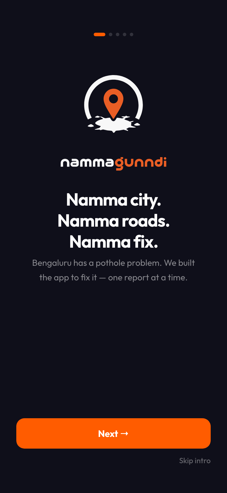
Namma Gunndi onboarding screen
01 · Onboarding
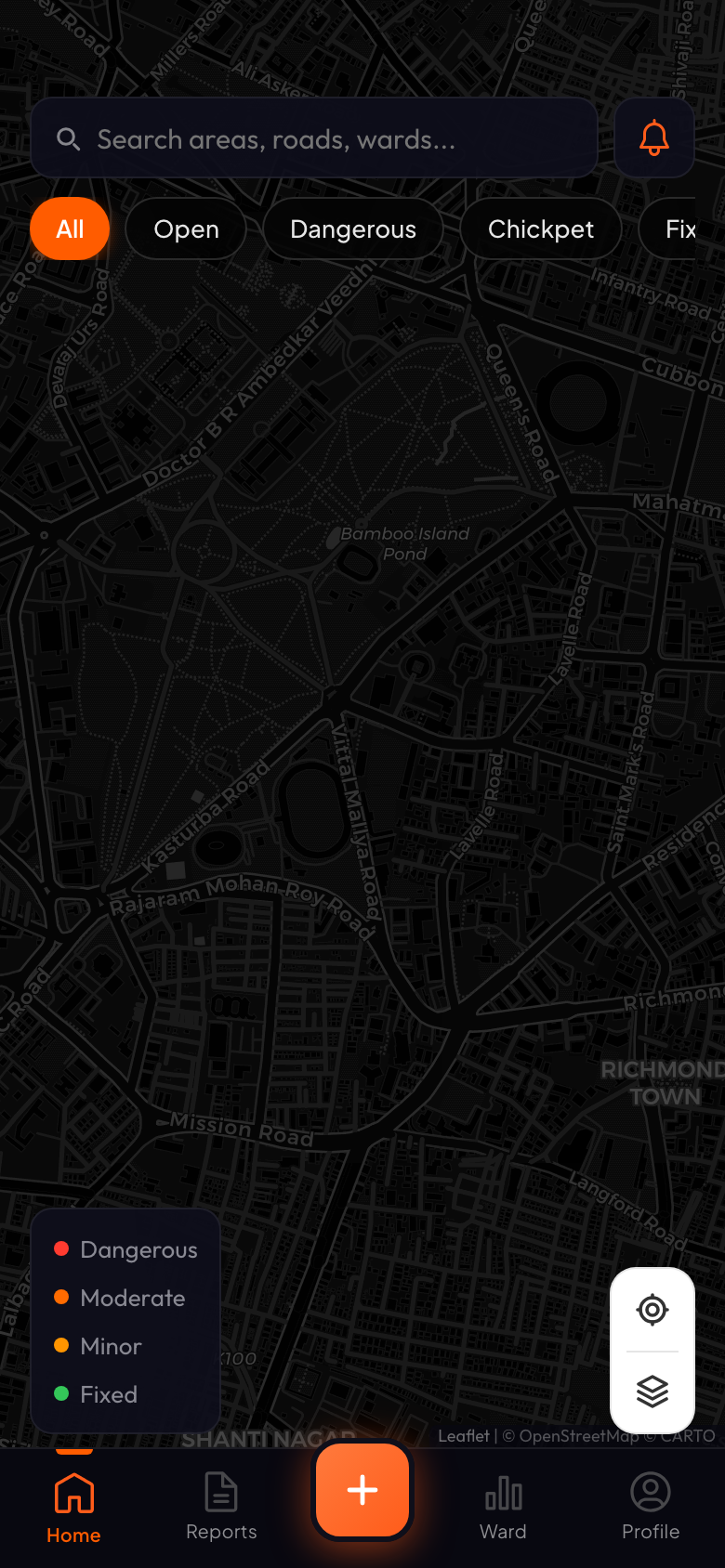
Namma Gunndi map screen showing Bengaluru with filter chips
02 · Map · Home
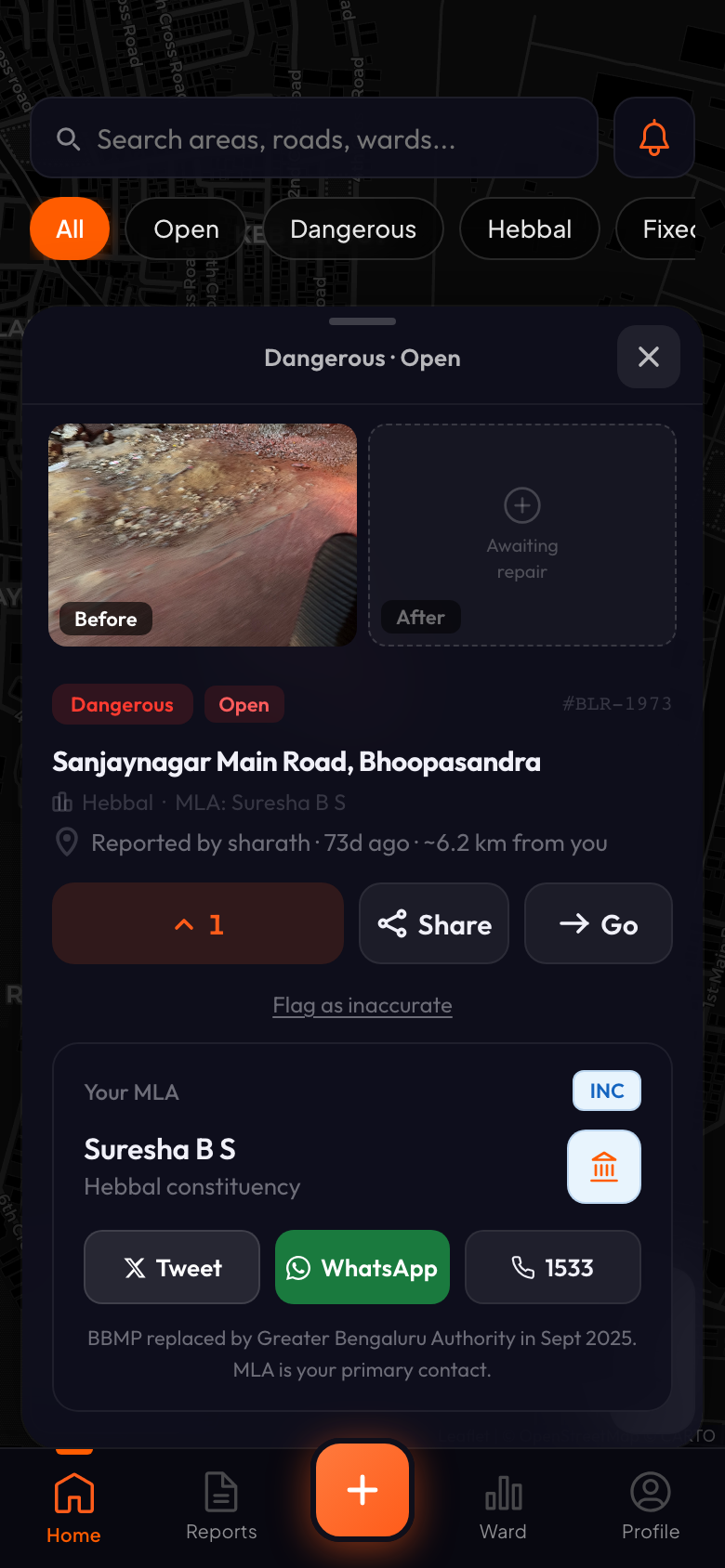
03 · Issue Detail
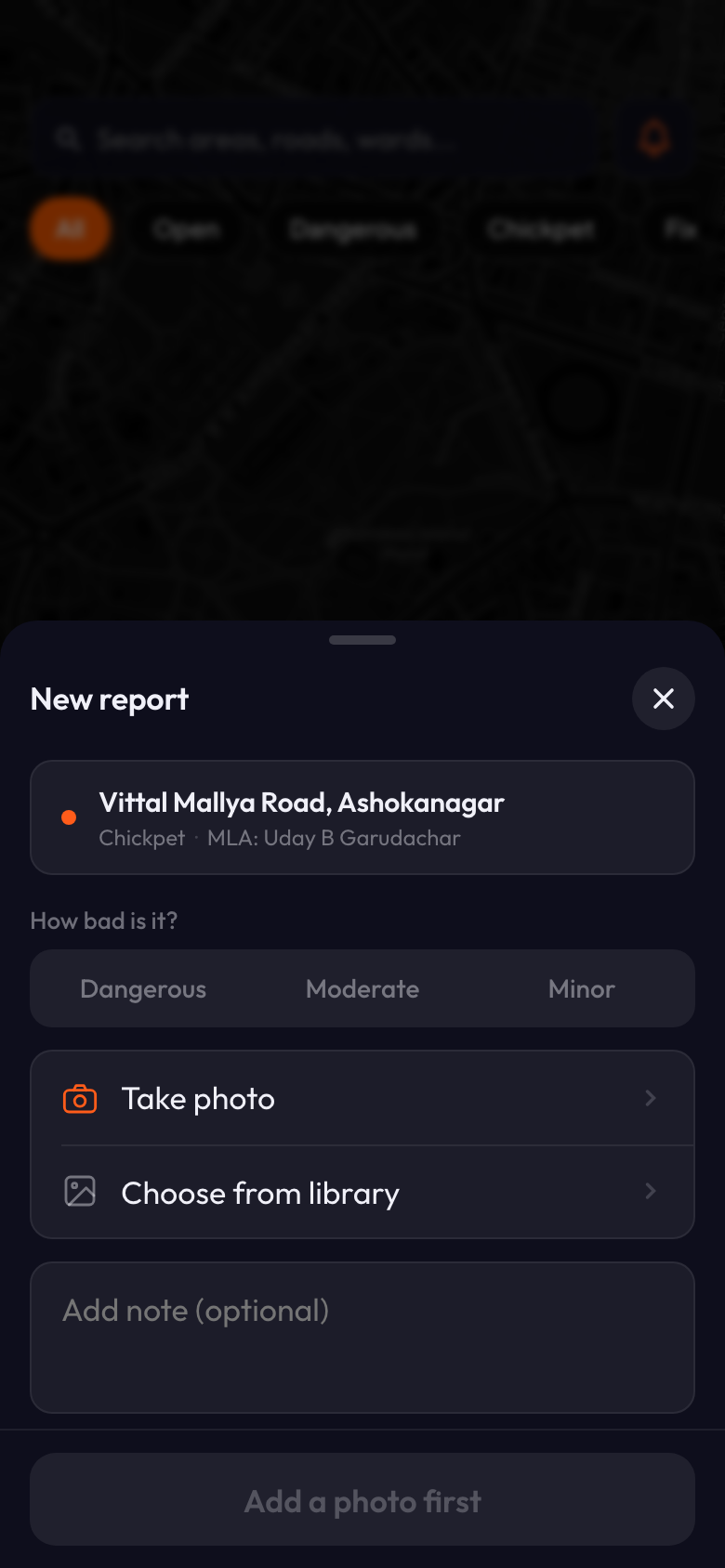
04 · New Report
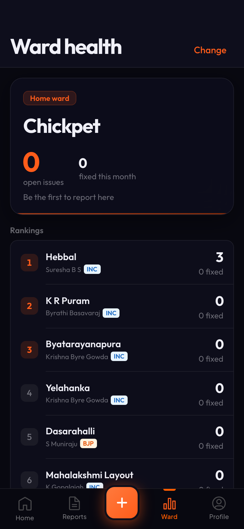
Namma Gunndi ward health screen with rankings leaderboard
05 · Ward Health
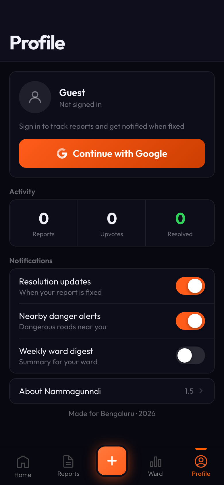
Namma Gunndi profile screen with sign-in and notifications
06 · Profile
Live
Shipped as an installable PWA on both web and mobile web.
6
Screens designed and built end-to-end — Map, Detail, Report, Reports, Ward, Profile.
Solo
Designed, engineered and deployed by one person using AI as co-pilot.
Full-stack
Firebase for data + auth, Gemini for AI vision, Leaflet for maps.
Overview

A citizen's civic voice,
built for Bengaluru

I'm from Bengaluru. I've watched the city transform — booming infrastructure, exploding population — but one thing kept getting worse: the roads. As a daily commuter I've dodged potholes, slowed for craters, and seen accidents happen because of them. People have lost their lives to broken roads.

Namma Gunndi is my attempt to give citizens a real way to be heard — not just complain into the void, but report issues on a map, upvote what matters, and track what actually gets fixed. Built as a solo designer using Claude as my engineering partner, it's live today at nammagunndi.vercel.app.

The Problem

Crores spent,
craters remain

Reading the news made it worse: crores allocated for pothole repair year after year, yet the roads keep failing. The gap between funds and outcomes is invisible to the average citizen — and there's no accountable, transparent channel for a commuter to say "this road is dangerous, here's the exact spot, here's who else agrees."

Daily
Commuter Risk
Zero
Transparent Feedback Loop
Crores
Spent With No Visibility
Competitor Audit

What already exists,
and why it doesn't work

Before designing, I tried every existing option a Bengaluru citizen has today. Most were basic, outdated, or fully abandoned.

BBMP Sahaaya

Government-owned, but interface feels a decade old.

No community layer — you complain alone, into silence.

Status updates unreliable; citizens stop trusting it.

iChangeMyCity

Well-intentioned, but activity has slowed to a trickle.

Feels like a forum, not a real-time civic tool.

No mobile-first experience for commuters on the go.

Swachhata App

Sanitation-only scope — potholes and street lights excluded.

Cluttered UI, heavy app size, poor discoverability.

No sense of community or ward-level accountability.

Challenges

Shipping full-stack,
as a designer

01

Free & scalable map stack

Chose Leaflet + OpenStreetMap over paid Mapbox/Google Maps so the app has zero cost barrier to scale citywide. Added marker clustering for dense areas so the map never feels overwhelming.

02

AI-powered issue classification

Integrated Google Gemini Flash via AI Studio to auto-detect what a user's photo shows — pothole, garbage, streetlight, sewage — so citizens don't have to fumble through categories. Removes friction at the most drop-off-prone step.

03

Solo backend build

Set up Firebase (Firestore + Storage + Auth) end-to-end with Claude as my engineering partner. Real database, real uploads, real user accounts — no fake JSON.

04

Native-feel PWA on mobile web

Installable to home screen, bottom-sheet drag physics with spring-back, offline-ready caching. Feels like a native app without an App Store submission.

Signature Feature

Only real reports
get through

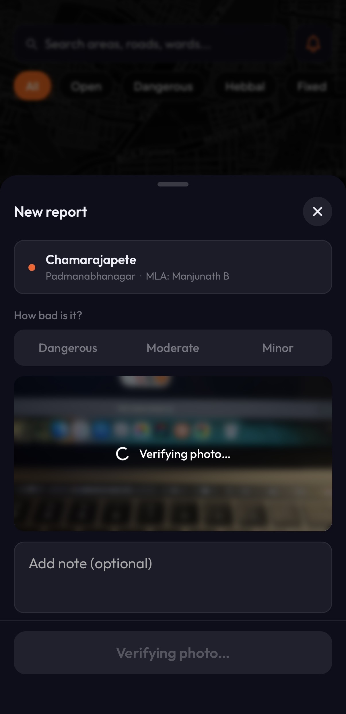
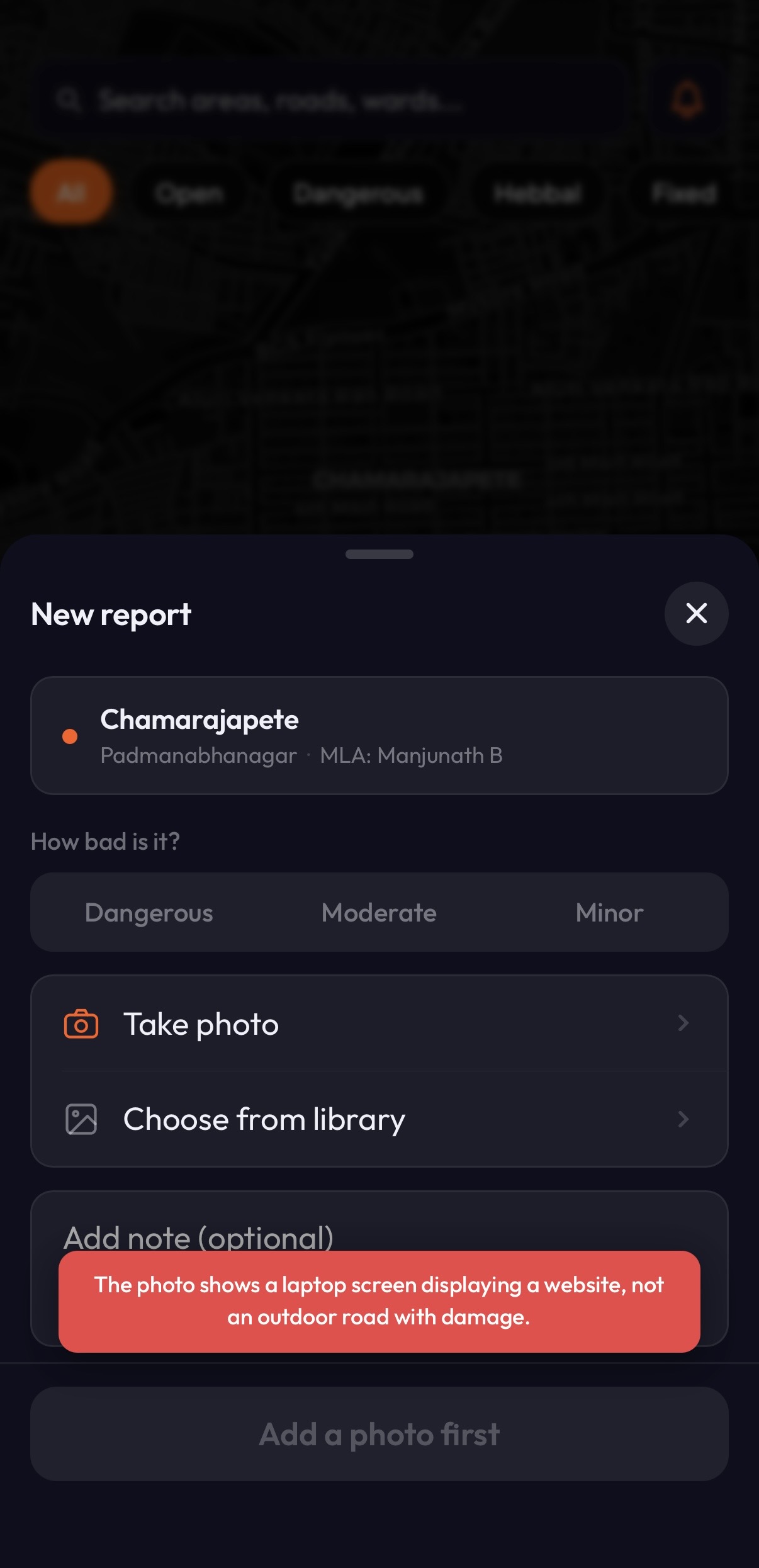
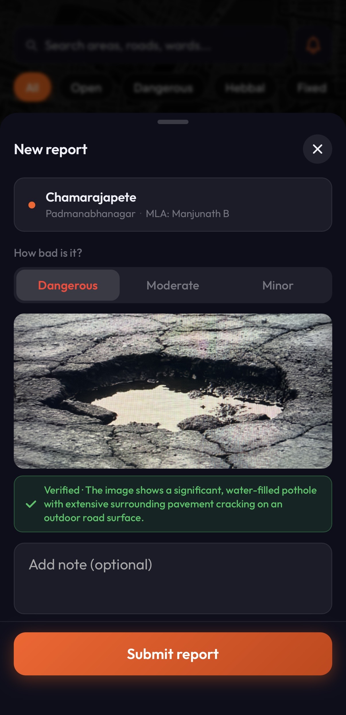
Free-to-submit civic maps die from noise. If people can upload anything, the map fills with screenshots, memes, and mistakes within weeks — and citizens stop trusting it. Every photo uploaded to Namma Gunndi runs through Google Gemini Flash before it reaches Firestore. The model reads the image, decides whether it's actually a road issue, and blocks it if not — with a plain-English reason the user sees instantly. No moderators. No delay. No spam.

Namma Gunndi verifying uploaded photo with Gemini
01 · Verifying
Namma Gunndi rejecting non-pothole photo with reason
02 · Rejected
Namma Gunndi accepting a verified pothole photo
03 · Verified
0
Moderators Required
~2s
Avg. Verification Time
100%
Photos Pre-Screened
Design System

Dark-first,
civic-orange

A CRED/Swiggy-quality visual language — dark surfaces, an alert orange (#FF5C1A) as the brand accent, glassmorphic overlays, and Outfit as the primary typeface. Civic tech doesn't have to look like a government form.

01

Signal-first color

Severity is encoded in color everywhere — red for dangerous, amber for moderate, yellow for minor, green for fixed. Users read the map without a legend.

02

Community over complaint

Upvotes, contributor leaderboards, ward-level stats. The tone is "we're fixing this together," not "please fix this for me."

03

Report in under 30 seconds

Three-step flow — Category → Severity + Photo → Location + Summary. AI classification pre-fills the category from the photo whenever possible.

The Build

Stack,
shipped with AI

Leaflet + OpenStreetMap

Free, open, scalable map stack with marker clustering for high-density issue areas.

Firebase (Firestore · Storage · Auth)

Real backend from day one — persistent reports, photo uploads, user accounts, live updates.

Gemini Flash (Google AI Studio)

On-device-feel AI image recognition to auto-classify uploaded issue photos.

Firebase + Vercel Analytics

Dual analytics stack — user behavior on one side, PWA install and performance on the other.

React PWA on Vercel

Installable, offline-capable, deployed on Vercel's edge network — one codebase for web and mobile web.

Claude + Claude Code

Every backend function, Firebase rule, and integration was researched and built with Claude as engineering partner. Designer-led, AI-executed.

Where It Is

Live today,
soft-launched

Namma Gunndi is live at nammagunndi.vercel.app with an admin dashboard for triage. Currently in soft launch — I'm still fixing edges and haven't opened it to public promotion yet. Next: ward-by-ward rollout with community partners.

Live
PWA Deployed
6
Screens Shipped
2
Apps (User + Admin)
~2mo
Solo Build Time
Reflection
"A designer with AI as a partner can now ship what used to require a full engineering team. Namma Gunndi is my proof of that."

Two years ago, this project would have needed a co-founder engineer, a backend contractor, and months of coordination. In 2026, I designed it, built it, deployed it, and I'm iterating on it — solo — with Claude in the loop for every technical decision.

The design skills didn't change. What changed is how much of a real product a single designer can now ship.